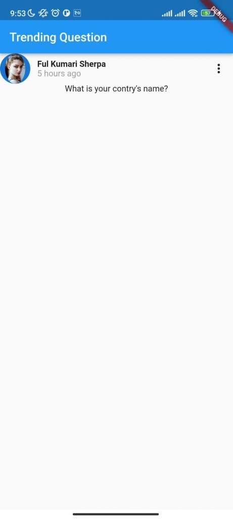
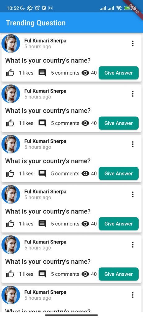
So in this tutorial we will be building the following UI. We will not discuss the topic that we have already covered in part 1. If you have not tried part1 of this series please go there and learn before reading this. So, in this tutorial, we’ll design the interface below. We won’t go over the subject that was addressed in part 1 again. Please go to part 1 of this series if you haven’t already and study before continuing.

We require a column with three child widgets for this user interface. The first child will be a row, the second a Container with a Text widget inside of it, and the third a row as well. So firstly we create that as shown in code below.
import 'package:flutter/material.dart';

void main() {
  runApp(MaterialApp(home: MyApp()));
}

class MyApp extends StatelessWidget {
  const MyApp({Key? key}) : super(key: key);

  // This widget is the root of your application.
  @override
  Widget build(BuildContext context) {
    return Scaffold(
      appBar: AppBar(
        title: Text("Trending Question"),
      ),
      body: Column(
        children: [
          Row(
            children: [],
          ),
          Container(
            child: Text("What is you contry's name?"),
          ),
          Row(
            children: [],
          ),
        ],
      ),
    );
  }
}
Then again in first row, we need a CircleAvatar with profile picture inside it and a column with full name and time the post has posted and a icon button at right corner.
import 'package:flutter/material.dart';

void main() {
  runApp(MaterialApp(home: MyApp()));
}

class MyApp extends StatelessWidget {
  const MyApp({Key? key}) : super(key: key);

  // This widget is the root of your application.
  @override
  Widget build(BuildContext context) {
    return Scaffold(
      appBar: AppBar(
        title: Text("Trending Question"),
      ),
      body: Column(
        children: [
          Row(
            children: [
              CircleAvatar(
                radius: MediaQuery
                    .of(context)
                    .size
                    .width * 0.065,
                child: ClipOval(
                  child: Image.asset(
                    'images/profile.jpg',
                  ),
                ),
              ),
              SizedBox(
                width: MediaQuery
                    .of(context)
                    .size
                    .width * 0.03,
              ),
              Column(
                children: [
                  Text(
                    "Ful Kumari Sherpa",
                    style: const TextStyle(
                      fontWeight: FontWeight.bold,
                    ),
                  ),
                  Text(
                    "5 hours ago",
                    style: TextStyle(
                      fontFamily: "poppins",
                      color: Colors.grey,
                    ),
                  )
                ],
              ),
          IconButton(
            onPressed: () {},
            icon: Icon(Icons.more_vert_outlined),
          ),

            ],
          ),
          Container(
            child: Text("What is you contry's name?"),
          ),
          Row(
            children: [],
          ),
        ],
      ),
    );
  }
}

Running this code will not get the required results since the icon button is not in the right corner and the user’s complete name and the time are not aligned correctly. So, we’ll start by attempting to remedy the align issue. The issue will be resolved if we start the columns for both of them from the start. You can do this by creating Cross Axis Alignment from start, as seen in the code below. The code needs to be entered after the column of fullname and time.
crossAxisAlignment: CrossAxisAlignment.startNext we need to fix the issue of right icon. To fix that we can group the Circle Avatar and column of full name and time to one row and icon inside the parent row of first child of column widget as shown in code below. Finally, we can make main axis alignment to spacebetween to fist row as shown in code below
 Row(
   mainAxisAlignment: MainAxisAlignment.spaceBetween,
            children: [
              Row(
                children: [
                  CircleAvatar(
                    radius: MediaQuery.of(context).size.width * 0.065,
                    child: ClipOval(
                      child: Image.asset(
                        'images/profile.jpg',
                      ),
                    ),
                  ),
                  SizedBox(
                    width: MediaQuery.of(context).size.width * 0.03,
                  ),
                  Column(
                    //crossAxisAlignment: CrossAxisAlignment.start,
                    children: [
                      Text(
                        "Ful Kumari Sherpa",
                        style: const TextStyle(
                          fontWeight: FontWeight.bold,
                        ),
                      ),
                      Text(
                        "5 hours ago",
                        style: TextStyle(
                          fontFamily: "poppins",
                          color: Colors.grey,
                        ),
                      )
                    ],
                  ),
                ],
              ),
              IconButton(
                onPressed: () {},
                icon: Icon(Icons.more_vert_outlined),
              ),
            ],
          ),
So, we are now done with first row. If you want to make even better in this UI, you can use padding, margin and you can also use different font that matches above design.
Now we can add some styling to text widget as shown in code below.
 style: TextStyle(
                  fontWeight: FontWeight.w500,
                  fontSize: MediaQuery.of(context).size.height * 0.021),
            ),
The text is not starting from the starting of screen, so to make that we can give cross axis alignment to start to the first column that we have used.
crossAxisAlignment: CrossAxisAlignment.start,Since we have started the column from the start, now we have to give some padding to left side of the text widget. Again we cannot give padding to text, so we have to give padding to the conatiner that is holding the text widget. So, give the padding to the container widget.
padding: EdgeInsets.only(left: 10, top: 10),Now that we are also done with the second children of column, now its time for the last one. In last one, we need a row we have already defined that. Inside row we need 7 children.
- Icon button with thumbs up icon,
- Text for like with fontsize 10
- Icon button with comment icon,
- Text for comment
- Icon with view icon
- Text with views text,
- Elevated button with text inside and rectangular border.
The code is given as below:
 Row(
                mainAxisAlignment: MainAxisAlignment.start,
                children: [
                  IconButton(
                    icon: Icon(Icons.thumb_up_alt_outlined),
                    onPressed: () {},
                  ),
                  Text(
                    "1 likes",
                    style: TextStyle(
                      // fontSize: 10,
                    ),
                  ),
                  IconButton(onPressed: () {}, icon: Icon(Icons.comment)),
                  Text("5 comments"),
                  SizedBox(width: MediaQuery
                      .of(context)
                      .size
                      .width * 0.009),
                  Icon(Icons.remove_red_eye),
                  SizedBox(width: MediaQuery
                      .of(context)
                      .size
                      .width * 0.009),
                  Text("40"),
                  SizedBox(width: MediaQuery
                      .of(context)
                      .size
                      .width * 0.012),
                  ElevatedButton(
                    onPressed: () {},
                    style: ButtonStyle(
                      shape: MaterialStateProperty.all<
                          RoundedRectangleBorder>(
                        RoundedRectangleBorder(
                          borderRadius: BorderRadius.circular(
                              MediaQuery
                                  .of(context)
                                  .size
                                  .width * 0.02),
                        ),
                      ),
                      backgroundColor:
                      MaterialStateProperty.all(Colors.teal),
                    ),
                    child: Text("Give Answer"),
                  ),
                ],
          ),
So, we are done with the design for now. To make multiple column of this whole column we need another column which is the parent column of this column, So we can use for loop to loop around the similar column. We can also use card view to give the elevation to the column as shown in code below:
 body:
          Column(
            children: [
          for(int i=0; i<10;i++)
          Card(
      elevation: 7,
      color: Colors.white,
            child: Column(
              crossAxisAlignment: CrossAxisAlignment.start,
              children: [
If you are little confused with this code, you can view full code which is given below.
To make these column scrollable, we can use Single Child Scroll View Widget.
.
import 'package:flutter/material.dart';

void main() {
  runApp(MaterialApp(home: MyApp()));
}

class MyApp extends StatelessWidget {
  const MyApp({Key? key}) : super(key: key);

  // This widget is the root of your application.
  @override
  Widget build(BuildContext context) {
    return Scaffold(
      appBar: AppBar(
        title: Text("Trending Question"),
      ),
      body:
          SingleChildScrollView(
            child: Column(
              children: [
            for(int i=0; i<10;i++)
            Card(
      elevation: 7,
      color: Colors.white,
              child: Column(
                crossAxisAlignment: CrossAxisAlignment.start,
                children: [

                  Row(
                    mainAxisAlignment: MainAxisAlignment.spaceBetween,
                    children: [
                      Row(
                        children: [
                          CircleAvatar(
                            radius: MediaQuery.of(context).size.width * 0.065,
                            child: ClipOval(
                              child: Image.asset(
                                'images/profile.jpg',
                              ),
                            ),
                          ),
                          SizedBox(
                            width: MediaQuery.of(context).size.width * 0.03,
                          ),
                          Column(
                            crossAxisAlignment: CrossAxisAlignment.start,
                            children: [
                              Text(
                                "Ful Kumari Sherpa",
                                style: const TextStyle(
                                  fontWeight: FontWeight.bold,
                                ),
                              ),
                              Text(
                                "5 hours ago",
                                style: TextStyle(
                                  fontFamily: "poppins",
                                  color: Colors.grey,
                                ),
                              )
                            ],
                          ),
                        ],
                      ),
                      IconButton(
                        onPressed: () {},
                        icon: Icon(Icons.more_vert_outlined),
                      ),
                    ],
                  ),
                  Container(
                    padding: EdgeInsets.only(left: 10, top: 10),
                    child: Text(
                      "What is your country's name?",
                      style: TextStyle(
                          fontWeight: FontWeight.w500,
                          fontSize: MediaQuery.of(context).size.height * 0.021),
                    ),
                  ),
                      Row(
                        mainAxisAlignment: MainAxisAlignment.start,
                        children: [
                          IconButton(
                            icon: Icon(Icons.thumb_up_alt_outlined),
                            onPressed: () {},
                          ),
                          Text(
                            "1 likes",
                            style: TextStyle(
                              // fontSize: 10,
                            ),
                          ),
                          IconButton(onPressed: () {}, icon: Icon(Icons.comment)),
                          Text("5 comments"),
                          SizedBox(width: MediaQuery
                              .of(context)
                              .size
                              .width * 0.009),
                          Icon(Icons.remove_red_eye),
                          SizedBox(width: MediaQuery
                              .of(context)
                              .size
                              .width * 0.009),
                          Text("40"),
                          SizedBox(width: MediaQuery
                              .of(context)
                              .size
                              .width * 0.012),
                          ElevatedButton(
                            onPressed: () {},
                            style: ButtonStyle(
                              shape: MaterialStateProperty.all<
                                  RoundedRectangleBorder>(
                                RoundedRectangleBorder(
                                  borderRadius: BorderRadius.circular(
                                      MediaQuery
                                          .of(context)
                                          .size
                                          .width * 0.02),
                                ),
                              ),
                              backgroundColor:
                              MaterialStateProperty.all(Colors.teal),
                            ),
                            child: Text("Give Answer"),
                          ),
                        ],
                  ),

                ],
              ),
            ),
    ],
    ),
          ),
      );
  }
}

So the main problem of this code here is the data is same for all the card, so to give different data to different card we can make a card builder and pass the value to that card builder.

