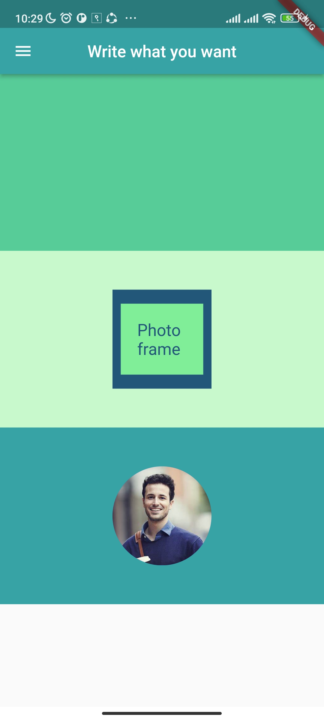
In this tutorial, we’ll design a straightforward user interface, as seen in the figure below. To create this ui, various widgets will be used.
Install the Flutter SDK, integrate it with an IDE (android studio or VS Code), and have a device available to run the code on. This device can be an emulator or your own phone with USB debugging enabled.
First make a new project with any name in flutter and inside runApp function, we have to give the MaterialApp widget otherwise it will throw “No MediaQuery widget ancestor found.” error.
So the code will look like this:
import 'package:flutter/material.dart';

void main() => runApp(const MaterialApp(home: MyApp()));

class MyApp extends StatelessWidget {
 const MyApp({Key? key}) : super(key: key);

 @override
 Widget build(BuildContext context) {
   return Container(
   );
 }
}
If you run this code, nothing will happen because we are returning a container to build a widget, but the container widget itself is empty.
In response, we must return a Scaffold widget. We can design an app bar, navigation bar, and floating action button with the use of a scaffold widget. We must pass the app bar attribute to the scaffold widget and the app bar widget to the app bar as shown in code below.
import 'package:flutter/material.dart';

void main() => runApp(const MaterialApp(home: MyApp()));

class MyApp extends StatelessWidget {
 const MyApp({Key? key}) : super(key: key);

 @override
 Widget build(BuildContext context) {
   return Scaffold(
     appBar: AppBar(),
   );
 }
}
Now if we run this code we can see the blue appbar in our application. To write some content inside that appbar, we have to pass the attribute called title. Inside the title we can write a Text Widget with the content you want to write inside it as in code below.
appBar: AppBar(title: Text("Write what you want"),),
You can also add some styling to the appBar like making the title in center and setting some background color as shown in code below.
If you run this code, you will be able to see the app bar at the center with background color as specified. Additionally, a drawer can be added to the app bar.
appBar: AppBar(
 title: Text("Write what you want"),
 centerTitle: true,
 backgroundColor: const Color(0xff38a3a5),
),
drawer: Drawer());
We are finished building the app bar, now it is time to design as needed. We must have 3 children inside a column, as is shown in the image above. Since those children don’t have any other styling, we may put them in a container with a specific height and color. So quickly make a column with three children as shown in code below:
body: Column(
 children: [
   Container(
     height: MediaQuery.of(context).size.height * 0.25,
     color: const Color(0xff57cc99),
   ),
   Container(
     height: MediaQuery.of(context).size.height * 0.25,
     color: const Color(0xffc7f9cc),
   ),
   Container(
     height: MediaQuery.of(context).size.height * 0.25,
     color: const Color(0xff38a3a5),
   ),
 ],
),
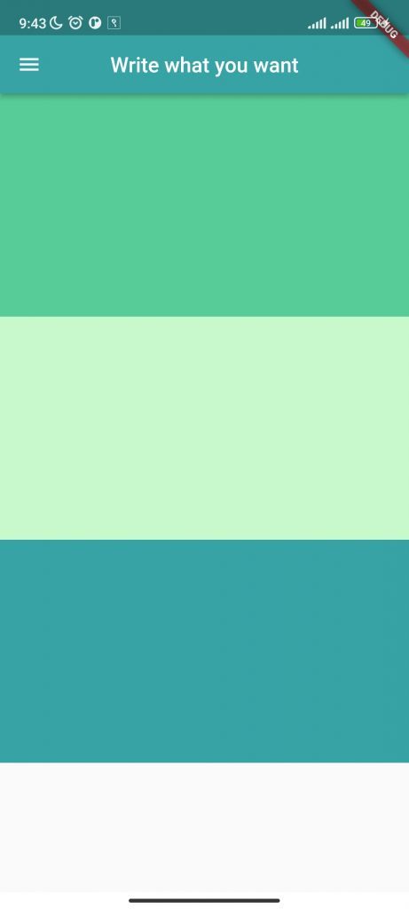
Now the app will look like this.
Now for the first column we don’t need anything, for second container we need another child container, with blue color inside it.
Container(
 height: MediaQuery.of(context).size.height * 0.25,
 color: const Color(0xffc7f9cc),
 child: Container(
   width: 120,
   height: 120,
   color: const Color(0xff22577a),
 ),
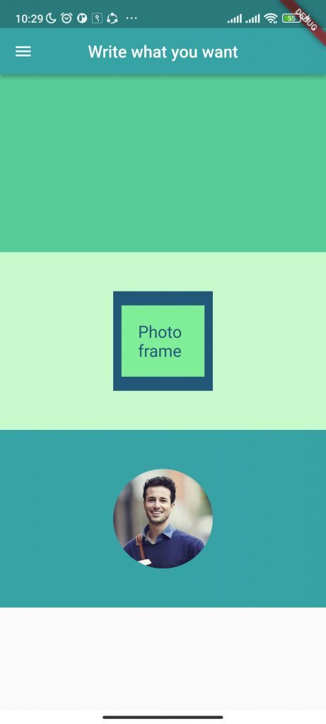
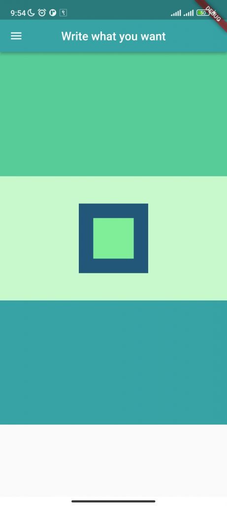
We can give the width and height to 120 or you can also use MediaQuery as done in the previous section. If we run this code, we don’t get the result as we expected. Inorder to make it in the center, put alignment to center before the container.
Before child container use the code:
alignment: Alignment.center,Now you will see the result as expected.
We can follow the same procedure as above in order to create a child container with a slightly smaller width and height and a different hue. Also don’t forget to align the container to center.
alignment: Alignment.center,
child: Container(
color: const Color(0xff80ed99),
width: 70,
height: 70,
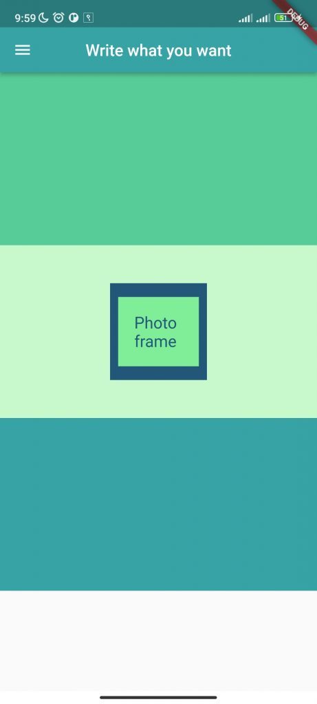
),Again we need some text inside the container, for that we can use a Text Widget as child of container widget:
child: Text("Photo Frame"),We may now adjust the margin and padding to look beautiful, and we must also style the text to match the design.
 margin: const EdgeInsets.all(10),
               padding: const EdgeInsets.all(20),
               child: const Text("Photo frame",
                   style: TextStyle(color: Color(0xff22577a),fontSize: 20)),
We have to write the code of margin and padding before the Text widget.
The final outcome will look like this:
Now We are left to design the last children only which contain the circular image.
We can use the CircleAvatar widget as the container’s children widget to create the circular picture design that is required. Remember to place this widget in the center.
All we need is a circle with an image inside it. In order to do that, we must specify the Circle Avatar’s radius and provide the background image’s url. The final child will look like this:
child: const CircleAvatar(
   radius: 60.0,
   backgroundImage: NetworkImage(
       'https://th.bing.com/th/id/OIP.XSZAFm-5JI7nriDLwZqRQQHaE7?pid=ImgDet&rs=1'))),
If the image doesn’t load on your device, please check if your emulator or your device is connected to the internet.
Here we are fetching images from the url if you want to display an image url you have to provide the image location.
Create a directory called images in the root directory first, then drag & drop the image inside of it as shown below:

After this go to pubspecs.yaml file and uncomment assets file and add your path to that code as shown below:
Please remove extra spacing before assets if necessary.

Finally, give the image location to the background image attribute;
backgroundImage: AssetImage("images/picture.jpg"),If the image doesn’t load, please do restart your ide.
The final output looks similar to the given one.
The final code is:
import 'package:flutter/material.dart';

void main() => runApp(const MaterialApp(home: MyApp()));

class MyApp extends StatelessWidget {
  const MyApp({Key? key}) : super(key: key);

  @override
  Widget build(BuildContext context) {
    return Scaffold(
      appBar: AppBar(
        title: Text("Write what you want"),
        centerTitle: true,
        backgroundColor: const Color(0xff38a3a5),
      ),
      drawer: Drawer(),
      body: Column(
        children: [
          Container(
            height: MediaQuery.of(context).size.height * 0.25,
            color: const Color(0xff57cc99),
          ),
          Container(
            height: MediaQuery.of(context).size.height * 0.25,
            color: const Color(0xffc7f9cc),
            alignment: Alignment.center,
            child: Container(
              width: 120,
              height: 120,
              color: const Color(0xff22577a),
              alignment: Alignment.center,
              child: Container(
                color: const Color(0xff80ed99),
                margin: const EdgeInsets.all(10),
                padding: const EdgeInsets.all(20),
                child: const Text("Photo frame",
                    style: TextStyle(color: Color(0xff22577a), fontSize: 20)),
              ),
            ),
          ),
          Container(
              height: MediaQuery.of(context).size.height * 0.25,
              color: const Color(0xff38a3a5),
              alignment: Alignment.center,
              child: CircleAvatar(
                  radius: 60.0,
                 //backgroundImage: NetworkImage(
     //  'https://th.bing.com/th/id/OIP.XSZAFm-5JI7nriDLwZqRQQHaE7?pid=ImgDet&rs=1')
                  backgroundImage: AssetImage("images/picture.jpg"),
                  ),
          ),
        ],
      ),
    );
  }
}